So before we started to plan and design our own portfolio site, we had to do some research. Our assignment was to find 3 successful and 3 unsuccessful portfolio sites and explain why we believe they are successful or unsuccessful.....
Successful sites:1. I thought
4/20 Creative was a successful site because of its simplicity. I like a site where I can see pieces or hints of the designer's work and if it looks interesting to me then I can click on it to view the entire piece. When you click on the small thumbnails of their work, a description/ explanation also comes up with the piece. I like being informed about the designer's work. The site starts out by showing all of the work (including branding, web, print, etc.), but if you choose to look at just web, or just print, then they give you the option of only viewing what you want to look at.
2.
Karen Craig, from Fuzzy Bug Studios, LLC, has a really cute site! I like the illustration she uses on the site. I really love how easy it is to navigate! The contact navigation is defiantly my favorite...I like how she shows the icon and when you roll over the link the word appears. I also like how she only lets the viewer focus on four pieces of work at a time. I think I could create a site like this....its simple and fun to look at at the same time.
3.
Sara Cumings' site has a really different feel and style that I like. Most portfolio sites do not have much scrolling, but I like how this site does. She shows pieces of her work, and when you click on them, it shows the what the piece is and allows the viewer to comment on her work. I like how her portfolio work has the same style and design as her site does. You can really tell what her style is and I'm hoping my portfolio site will accomplish this.
Unsuccessful sites:1.
David Kerr Design is a portfolio site that is too cluttered in my opinion. There is too much going on. I don't like the flashy animation that is on the main page. I feel like there are too many places for me to go to....I don't know where to start! I also don't like how the work is displayed. I like the small pieces that it shows but I don't like how if you roller over the work that it shows the larger image at the same time.....its a neat affect but I believe because there is so much work on that page that it seems kind of cluttered.
2. This
Chimp Champ Design site scared me!! The first thing that I noticed was the overwhelming background. The monkeys look mean and that take my attention away from the rest of the site. I cant concentrate on their work. To top off the pattern crisis...they put another overwhelming pattern on top of the monkey heads!!! That's just too much for my eyes!! If I don't like how the site looks at first glance then I'm not going to want to continue looking through the site.
3.
Danaher Design could definitely do something better with their portfolio site. I don't like how I can't be interactive with this site....their work is pretty much a slide show. The design of it is not very eye-catching either. It needs to represent their work, or should at least be designed well. This site is just not, in my opinion, an ideal portfolio site.


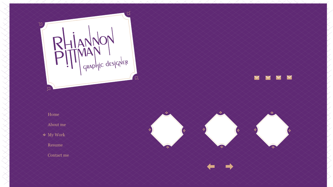
 So as of right now I believe my site map will look like this, but as I said I will change my mind a lot so there is no telling what the finished product will be!!