Thursday, November 19, 2009

New desk calendar cover....


Please comment!! I think I've been looking at this calendar for too long to decide if it looks good or not!!

Tuesday, November 17, 2009

new home page....


So I've worked on my home page some....I'm still thinking of how I want my portfolio pages to look so there is more to come!

Monday, November 16, 2009

Wednesday, November 11, 2009

Portfolio site content

I have a feeling that I am going to be changing my mind a lot as I build my portfolio site. Right now the basic content I want to include in it is:

About Me info: This will include things that I enjoy doing, my favorite things to design, my interest, personality, etc. I want the viewer to get an idea of, not only what kind of designer I am, but also what kind of person I am.

My Work: This basically my portfolio. Like I said earlier I am going to be changing my mind a lot probably and this is going to be one of those areas that will change a lot throughout my process. I'm not sure how I want to organize all of my work. If I had more work experience I would separate things according to what Job I did them under or maybe organize them in a time period (yearly, monthly, etc.).....BUT seeing how I do not have that much work experience I believe I am just going to have all of my work in one large group. I will be sure to design this page in a way that it will make the viewer want to click on things to see and learn more about each piece.

Resume: This kind of explains itself. I just want to include my resume for any curious viewer to see. I also want to include a printable version so that anyone interested in hiring me may have a hard copy for themselves as well.

Contact Me: Under this I will of course have my email since it will be the best way to reach me. I also will include my blogger URL so that they may see what I am currently working on or interesting things that I may be blogging about. I am also thinking about including my facebook because it also something that I constantly on and it would be a great way to reach me.
So as of right now I believe my site map will look like this, but as I said I will change my mind a lot so there is no telling what the finished product will be!!

Sunday, November 8, 2009

Portfolio sites! .....Finally!!!

So before we started to plan and design our own portfolio site, we had to do some research. Our assignment was to find 3 successful and 3 unsuccessful portfolio sites and explain why we believe they are successful or unsuccessful.....

Successful sites:

1. I thought 4/20 Creative was a successful site because of its simplicity. I like a site where I can see pieces or hints of the designer's work and if it looks interesting to me then I can click on it to view the entire piece. When you click on the small thumbnails of their work, a description/ explanation also comes up with the piece. I like being informed about the designer's work. The site starts out by showing all of the work (including branding, web, print, etc.), but if you choose to look at just web, or just print, then they give you the option of only viewing what you want to look at.


2. Karen Craig, from Fuzzy Bug Studios, LLC, has a really cute site! I like the illustration she uses on the site. I really love how easy it is to navigate! The contact navigation is defiantly my favorite...I like how she shows the icon and when you roll over the link the word appears. I also like how she only lets the viewer focus on four pieces of work at a time. I think I could create a site like this....its simple and fun to look at at the same time.

3. Sara Cumings' site has a really different feel and style that I like. Most portfolio sites do not have much scrolling, but I like how this site does. She shows pieces of her work, and when you click on them, it shows the what the piece is and allows the viewer to comment on her work. I like how her portfolio work has the same style and design as her site does. You can really tell what her style is and I'm hoping my portfolio site will accomplish this.

Unsuccessful sites:

1. David Kerr Design is a portfolio site that is too cluttered in my opinion. There is too much going on. I don't like the flashy animation that is on the main page. I feel like there are too many places for me to go to....I don't know where to start! I also don't like how the work is displayed. I like the small pieces that it shows but I don't like how if you roller over the work that it shows the larger image at the same time.....its a neat affect but I believe because there is so much work on that page that it seems kind of cluttered.

2. This Chimp Champ Design site scared me!! The first thing that I noticed was the overwhelming background. The monkeys look mean and that take my attention away from the rest of the site. I cant concentrate on their work. To top off the pattern crisis...they put another overwhelming pattern on top of the monkey heads!!! That's just too much for my eyes!! If I don't like how the site looks at first glance then I'm not going to want to continue looking through the site.

3. Danaher Design could definitely do something better with their portfolio site. I don't like how I can't be interactive with this site....their work is pretty much a slide show. The design of it is not very eye-catching either. It needs to represent their work, or should at least be designed well. This site is just not, in my opinion, an ideal portfolio site.

Wednesday, October 28, 2009

more secondary pages


new secondary pages

Here are 2 of my edited secondary pages.....I still think there could be more done to them.

Tuesday, October 27, 2009

so its starting to come to me!!!

I've had some huge designer blockage tonight....but some ideas finally started coming to me on how to make my home page a little more fun to look at. I believe this is an improvement from what I had.....I haven't posted my secondary pages yet because they still need some work. Hopefully I'll get some helpful feedback tomorrow in class to help make my site even better!

Leave-Behind....

We've been working on our leave-behinds in Senior Seminar. Our second critique is on Thursday. At our first crit, I really was not completely happy with the mock-up I had. I want to have something unique and fun to look at and touch.....what I had was not. A better idea struck me last night!! I really wanted to have something small, and I already had an idea of what I wanted my business card to look like. I also like the idea I heard during our first critique of an accordion fold. So I decided to combine all of those ideas! Here is what the layout of it will look like when its completely unfolded....
After folding it in half the long-ways.....and then folding the rest of it accordion style, it will look like this on the front......
The front will look like what I want my business cards to look like. The rest of the piece will have pieces of some of my work to show off different things I have done. This also goes with what my resume looks look so I am really happy with this new idea! :)

Luke Miller Buchanan

For my other client, I had to create promotional pieces and advertisements for NC photographer Luke Miller Buchanan. I created a postcard that could me mailed or used as a e-vite. I also created a poster to post around campus.
(front of postcard)
(back of postcard)(poster)

Finally finishedddd!!!....i think haha

This is the poster I have been working on for the Admissions Office. My job was to create a poster on the given topic of Commencement to represent the traditions we have here at Peace College. I felt the best was to do this was to show how the traditions have been kept or changed through all of the years by using a time line. What do you think?

Monday, October 26, 2009

first 2 secondary pages

I'm not sure if I completely like these. I feel like I could do more to them to make them more unique....I'm just not sure what to do to them.

edited homepage....

Tuesday, October 20, 2009

Friday, October 16, 2009

Wednesday, October 14, 2009

Wire frames

Here are a couple of wire frames that I have come up for my non-profit website:

Content Outline

The non-profit website that I am creating will need to have a good amount of information because it is reaching out to a few different types of viewers (parents, children, and future/current workers, volunteers, or people who want to donate). My content outline will describe the information it will contain. (This will also help me with creating the site map for this website.

*Home page - Will contain current news/events
*About Us - Will contain different links to inform the viewer about the organization.
-Contact US
-Our Mission
-Our History
-Our Staff
-Our Locations
*Get Involved - Will contain links that will inform the viewer of several ways to get involved with the organization.
-Donate
-Volunteer
-Job Opportunities
-Other ways to help
*Programs - Will inform viewer of what kind of clubs/programs are offered and their purposes
-About our programs
-Core programs
-Different Clubs
*What's Happening - This page will be a continuation of what is posted on the home page.
-Current Events/News
-Photo gallery

Monday, October 12, 2009

Non-Profit website

Our next assignment in Design for the Screen is to create a website for a non-profit organization. I chose to the Boys and Girls Club of Wake County. This is an organization that provides a safe place for kids to learn and grow. The organization also provides ongoing relationships with caring adult professionals, life-enhancing programs and character development experiences, along with hope, and opportunity.

The content I'm going to include on this site will the "Home" page (which will include main/current events), an "About Us" page (which will include the organization's mission, history, staff, and locations), a "Get Involved" page (which will show viewers how to donate, volunteer, job opportunities, and other ways to help), a "Programs" page (which will include all of the different programs and different clubs they have for kids), a "What's Happening" page (which will be a continuation of the current events/news on the home page, alone with a photo gallery).

The goal of this site is to educate current and future members and staff of the Boys and Girls club of what the organization is doing to fulfill their mission. It will also be used to persuade people to work, donate, or volunteer at the organization. The audience that will be viewing this site will be parents and current/future workers of the organization.

Monday, September 28, 2009

Monday, September 21, 2009

Wireframes

The restaurant's website that I have chosen to re-design is Fosters Bar and Grill. Fosters is a really nice place to go and eat and hangout with friends, but their website is kind of on the scary side!! I've decided to keep things pretty simple for the site. Here my wireframe ideas that I am playing around with....

Thursday, September 10, 2009

"Becoming a Graphic Designer"

Our reading assignment in Senior Seminar was in Becoming a Graphic Designer by Steven Heller & Teresa Fernandes. After reading, we where to decide on what design specialties we would like to pursue in once we get into the real world. I have to say that I was pretty interested in all of them. I believe book design would have to be my favorite (at least right now). I believe one reason why I like this area of design is because I love to read. Whenever I have the time I enjoy lounging around and reading a good book! I always enjoy looking at the design of books too! I love going into book stores and looking at book covers and flipping through the pages to see what kind of paper is used, and see if the text looks fun and easy to read (that sounds weird, I know). I have only had one project so far where I have designed a book cover but I really enjoyed it. I like how you can put your own creativity and style into it, but at the same time you are still restricted to certain things because of the author, type, etc. I enjoy working with type too which is another reason why I like book design. It is not just limited to designing the cover, there is also the interior design. There are also different categories that you can specialize in when designing books. There are text books, children's books, novels, etc. I would have to say I also like the fact that the majority of the time, the design of the book sales the book!

Corporate design is an area that I have gotten a lot of experience in, not only through class projects, but also through what I guess you would call side jobs. I like making identities for companies. I find it fun to be able to create a brand and put it on different things. While you have the consistency, everything you put it on still has its own style.

Another area of interest would be advertising. Advertising is everywhere and anywhere you look! In today's society, company's and organizations thrive off of their advertisements. There is always going to be a need for an advertisement designer. What I like about advertising is that designers have to always be unique. I love designs that are clever, or so simple that no one else would have ever thought of it. I feel like I would like advertising even more if I got into motion design (or commercials).

There are a couple of other areas that I would like to have the chance to experience someday. Music/ CD design would be fun. I think the reason I like this is because its kind of similar to book design, in the sense that you can add your own person style and creativity, and there are also different genres of music just like there are different types of books. Music design also involves a lot of type as well. Interactivity (or web design) is something I am interested in also. But seeing how I'm just now in my first web design class, I want to learn a little more about what's involved in this. Hopefully, after I get a little knowledge and experience in it, it will be something that I will enjoy too.

Wednesday, September 9, 2009

~Senior Seminar Agenda~

In Senior Seminar we've been looking over everyone's work to make our portfolios top knotch! (long process by the way!) After my work was looked over, I got an idea about what I should use in certain interviews and what I should not use. I have a lot of work to do on all of my stuff though (no surprise there). I think that I will pace myself by working on at least one project a week. If they seem pretty simple to fix, then I'll make it two a week. I want to get all of my projects to where I am 100% pleased with them (I think that's possible..haha). While I'm working on everything, I also want to make sure I know how to talk about them. Some of my projects I feel comfortable presenting while others are not so easy for me to present. I want to make sure when I'm in a interview I can just speak about them naturally, so I don't get suck and have that awkward moment of silence!!! But if I stick to doing this with at least one project a week I feel that my portfolio will be pretty strong in the end.

Word it!

This month's Word It word was "Back." Being a graphic designer and all I've learned the hard way that you should always back up your work! ALWAYS!!! So for the word "back" I decided to represent my life! ....the USB, aka: my back up!

Tuesday, September 1, 2009

Unsuccessful Websites.....

Soooo....it was interesting to look for unsuccessful websites.  Some of the ones that I found to be pretty bad are....

MYSPACE!!! I absolutely hate myspace!  It used to be pretty cool when it was simple.  Now they have added every little application that they possibly could think of.  It is so overwhelming, and I do not like to use it anymore.  It also annoys me that there is so much stuff that people can add to their pages to make them look so cluttered!! The site is not very easy to use either when it should be.  For example....if I want to find a friend, I can't just type in their name like I can on Facebook.  Their "username," or how they have it listed on their page has to be typed in or their email....I usually do not know that stuff!! So it makes it impossible to find.

Wikipedia is another site that I just do not understand.  It is supposed to me an online encyclopedia, but I don't understand why it allows users to add or make changes to the information.  It is nice, however, that this site is offered in so many languages, but that is pretty much (in my opinion) they only good thing about it.  There is so much going on on this site....and its stuff that I really don't care to know about.  The site is also kind of confusing and frustrating to use.  I just don't like this site.

So I know I wasn't supposed to but I googled "badly designed websites."  After looking around for a bit, I found Tyra Banks' website.  This site drives me nuts with all of the flashy animation mess!  Everywhere you click there is something going on.  I don't enjoy so much motion picture stuff on one page....especially if I don't want to watch it to start with! 

WORD IT!

So underconsideration.com has a thing called "Word It" where designers can send in something that represents the the monthly word they have given. The word for August was "hairy"....here's what I came up with:I was inspired by one of my friends who always jokes that he has hair...just in the wrong places!! hahaha (he doesn't have much where he needs it...on top of his head!)

Reading Assignment #2...

Homework assignment was to read pages 22-37 in The Principles of Beautiful Web Design and pages 20-29 in Don't Make Me Think.  Here are the questions I came up with after doing the readings....

1. What is the difference between "fixed-width" and "liquid-width" layouts?

2. What are some things that should be considered, or things that the client should be asked, before starting to design a website?

3. What are the three most common kinds of layouts used when referring to navigation placement?


Answers:

1. Fixed-Width: Can appear to be small/dwarfed in larger browser windows, does not have a horizontal scroll bar, the designer has more control over how an image floated within the content will look, allows for planned white space, narrower text blocks improve readability.  Liquid-Width: Has a horizontal scroll bar, adapts to most screen resolutions and devices, reduces scrolling, text spanning a wide distance is more difficult to read, more difficult to execute successfully, can cause a lack of (or awkward) white space.

2. What kinds of content do they want to provide on the site? How much content do they want to provide? Do they have a consistent logo that brands their company?

3. Left-column navigation, Right-column navigation, Three-column navigation.


Sunday, August 30, 2009

Exploring Successful Websites....

After learning some rules and techniques of what a successful website looks like, I did some exploring to see exactly what they look like....

The Cupcake Shoppe's website is my favorite of the three I chose to talk about. This website is very pleasing to look at with its pastel colors. The site follows several of the good aesthetic rules. It clearly follows a grid and is very organized. There is a lot of white space too, which doesn't make it look cluttered. The site is repetitive as you look through all of the different pages with they layout. This site is really fun, and easy to use......it doesn't make me think!

The second site I looked at was for students & and other youth in the "Open Door" ministry. I found this site through our reading. The colors and design are what caught my eye. After looking through the website, I noticed it seem to be repetitive like the cupcake site. The colors, the font, and the majority of the layout was the same throughout the site. It follows the rule-of-thirds and it has a lot of white space to help make it look clean and organized. It is very easy to learn!

The last website I looked at was the Camelbak website. I was just curious to see what this site looked like since they have such popular products. There is a lot of white space on this site and it does not scroll; meaning it is only shown "above the fold." It definitely follows the rule-of-thirds because the grid is clearly shown by the boxes they use to organize everything. It is extremely easy to use and follows the 3-click rule.

Friday, August 28, 2009

Questions from the first reading!!

Hi all,

Here's the questions I came up with from our reading assignment (from pages 1-22 in Principles of Beautiful Web Design Layout and Composition).

1. What are the two main standpoints from which most people determine whether a website design is "good" or "bad"?

2. Where should all main navigation items appear on a site's layout? (HINT: Think about the newspaper metaphor).

3. What rule is used to help designers create a well-balanced and proportional layout?


Answers:
1. There is a usability standpoint (focuses on functionality, effectiveness, and efficiency) and an aesthetic perspective (focuses on presentation, animation, and graphics).

2. Above the fold

3. The Rule of Thirds (aka: the grid)

Wednesday, April 29, 2009

2nd Social Justice poster in progress.....

I have decided to go along with my fortune cookie idea for my second social justice poster. In the crit, the background was something that wasn't liked very much so that's what I decided to work with. I ended up just using the hands from my original poster and putting them with a different background. I also wanted to change what the fortune says so that is why there is nothing written on it at the moment. Its still a work in progress......

Wednesday, April 22, 2009

GREEN is GOOD! :)

My client is the Peace College Wellness Center. I created a promotional campaign called “What can one person do?” The goal of my project is to educate the viewers on how to help create a healthy world. I also want to inspire people to do something to create a healthier world, even if its small.
I felt like the best way to achieve my goal was to create an installation of things that are bad for our world and of things we can do to make our world healthier. By using massive amounts of certain objects, I am hoping to catch the viewers attention and shock them with reality of the facts that I have provided along with the objects. The facts that I provided will also educate the viewers and hopefully will inspire them to do something to promote a healthier world.

Tuesday, April 21, 2009

Still playing around with this one...

So I'm pretty satisfied with how this poster has turned out. I'm still playing around the with type on it though....I thought I would try to play with the type in the clouds so I did a tutorial on how to make my type look like clouds!


I don't think I'm going to end up doing my final piece this way, I just wanted to see how it would look if I tried it.

Monday, April 13, 2009

More poster's/ Tutorials....

One of my ideas for the social justice poster is to have a woman looking at a fortune cookie. I took a picture of my mom looking at a homeade fortune...then I found some tutorials on things I could do to the photo. The first one is makes my photo seem like a movie poster/ scene. The second gives it a comic book effect. I believe I will end up changing what the fortune says if I end up using this idea....

Poster/ Text Tutorial


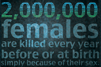
I wanted to try one of the text tutorials that we have been talking about in class. So I did the one off of Tutorial 9. I decided to use my own information for the tutorial though so I could use it on one of my social justice posters. The poster isnt finished of course because I want the whole poster to look like the "2,000,000." I just did this for now to get other's opinions on this idea. What do you think?

Wednesday, April 8, 2009

New Project!

So we're moving on to project numero tres in Imaging class. I believe this project is going to be fun...our job is create two posters that represent a social justice topic of our choice. I have chose to do my posters on female infanticide. This is huge problem all over the world, but it mostly takes place in third world countries. It is a huge problem in larger countries as well, such as China and India. This is such a touching topic to me, and I cannot believe that lives are thrown away just because they are female. I am leaning towards taking an emotional or shocking stance with this project. When people look at my poster, I want them to feel just as touched by this topic as I am.

Tuesday, April 7, 2009

:)

I really like this tutorial. Its really easy and I kinda got carried away with it....

Tuesday, March 31, 2009

Rhi is smokinnnnn

So photoshop lady had some pretty cool tutorials on playing with text. I thought the smokey type looked pretty fun so I tried it out with my name! Whacha think??

Saturday, March 21, 2009

Life at 20...

I did a tutorial on typography wallpaper. I liked th look of it and wanted to use it for my "twenty" postcard. I followed the tutorial but I added my own touch to it so I could use it for my postcard.....what do ya think?

http://abduzeedo.com/reader-tutorial-typography-wallpaper-photoshop

Wednesday, March 18, 2009

John's grl wuz hur!


To make my "john" postcard more creative I did a tutorial on how to create a desk environment. I learned how to make note book paper! I didn't realize that its just two different patterns on top of each other....its so simple! I also how to put scratches onto a wooden surface (or in this case the desk). I decided to do this tutorial with things that I could use in my project, so mine is all about lover boy John!! <3

Try this tutorial out! http://psd.tutsplus.com/tutorials/interface-tutorials/how-to-create-a-desk-environment-in-photoshop-from-scratch/

More from Monday's crit...

So...I have a million ideas running throught my head about what to do for some of my other post cards thanks to my lovely classmates :) Here are my thoughts:

*For "twenty" I am not using the picture of the girl. I still want to create a montage but I want to use all type for this postcard. I want to have the number twenty as my main focus. The number will be created with quotes, words, sayings, thoughts, events, etc. of a twenty year old female. I found a tutorial on how to create something like this which I will post shortly :)

*For "gear" I originally had a picture of barbie that had arrows pointing to various parts of her body labeling her "gears." The idea behind this was to show how women's bodies are seen as objects or tools. This triggered the idea of comparing the woman's body to a car (two things that men are both obsessed with). Instead of labeling a woman's body I have decided to actually put the parts of the car onto the body. I believe this would be considered a montage. I am having trouble creating this though because so far what I have looks like I have just cut and pasted everything. I want the parts to look more realistic and actually curve to the body.
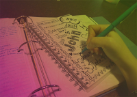
* I will post another tutorial along with the other one on how to create a desk environment. This is going to be for my "john" postcard. What I have now isn't bad, but I want to add more to it and this tutorial will really help out with that.

* I was given the idea to use barbie throughout some of my postcards instead of just on one of them. I plan on using barbie for "facade" but I'm not exactly sure how I want to create it yet. Thats something to be looking for on future posts....

babies :)


I have been working on some of my postcards from Monday's critique. Everyone seemed to like my "expectation" version with the baby on it so I decided to use that. I added words "mommy" and "congratulations" because I thought it needed to a little more to be considered a collage. I still might consider adding something else but I'm not exactly sure what at the moment. If you have any, let me know! :)

patterns and such...

I have been interested in learning how to make my backgrounds look more interesting than just a solid color so I decided to do a pattern tutorial. This tutorial was very simple and I am already creating different patterns to use in my postcard project. I have been taking the tutorial a few steps further and adding different things to them such as making them look like textures instead of just a pattern. Here is the pattern I created during the tutorial...

http://pshero.com/archives/creating-custom-patterns

Tuesday, March 10, 2009

Reflections.....


So I decided to do a photoshop tutorial on how to make a reflections on sunglasses. This tutorial was pretty easy. It was as simple as selecting the lenses with the lasso tool, merging two photos together, and creating a clipping mask. To make the reflection look more realistic on the glasses, I used the "spherize" tool and also added a "inner shadow." This tutorial was a great way to learn how to work with several different layers as well.

Try it out! http://www.photoshopessentials.com/photo-effects/sunglasses/

Sunday, February 22, 2009

Postcard Project

For this project I have decided to use different types of facial expressions to express the different qualities of words using collage, montage, and patterns to communicate their meanings. I will either find pictures and make them my own, or take the pictures myself. For example, for the word "gear" I would have a side shot of a person who seems to be thinking really hard. I would have a collage of different types of gears and gadgets in the the person's head representing the brain thinking.

Wednesday, February 18, 2009

Every company needs em...


SO....every company needs the basics....I created business card for Bob & Sue so they could advertise cider shoppe. To make their company a little more professional I created a letterhead for Simply Sider. I also thought a gift card would be a nice touch for their company.