Wednesday, May 5, 2010
Using a little bit of Buchanan!
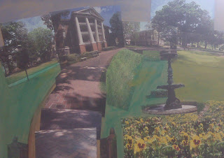
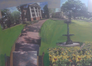
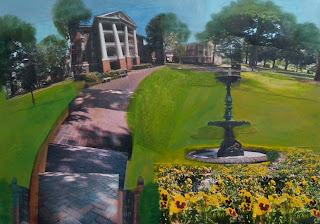
This last project I was required to use the style of a local mixed media artist, Luke Miller Buchanan. In this piece I took photographs of things around the front of Peace College's campus. I cut, and distorted the images in a way that it would make the scene have visual hic-ups. I then painted these images together into one piece.
My version of David Hockney's style....
For this project I was required to choose a painter and research his/her composition and style. The painter I chose was David Hockney. It was difficult to chose a style from Hockney because he had so many to choose from! I really liked how some of his work was on multiple canvases so I decided to use that trait in my piece. He also paints things realistically, which is also another trait of his that I used. To add my own personal touch to this piece, I decided to create the objects in this still life with a random color palette. I used colors that you would not normally see on some of these objects.
Thursday, April 1, 2010
Dirty Messy Painting
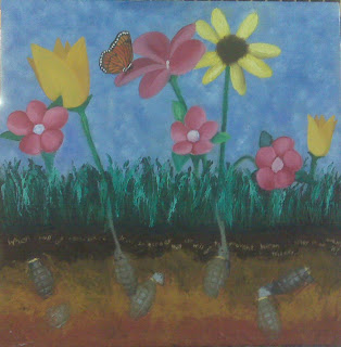
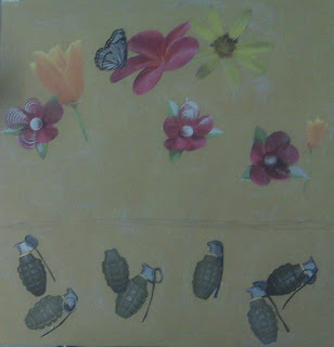
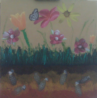
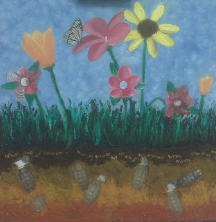
So this painting is based off of a quote that I found that states "When will our conscious grow so tender that we will act to prevent human misery rather than avenge it?" I was required to make this painting "messy" so I decided to use a lot of different techniques to create this piece. I cut and glued pictures to the ground to help lay a foundation. I decided to give the dirt and grass a texture to it, so I used cold wax as a medium. I wanted to make the dirt dark and messy to represent the "human misery" and the grenades represent the violence of "human misery" but also represent the bulbs of the flowers that are growing. The flowers are representing humans "preventing" the "human misery" symbolizing peace. To include the quote in the piece, I chose to scratch it in with a screw. The large image catches the viewers attention, but I put the quote on small so it would draw the viewer in to look closely at the detail.
Sunday, February 14, 2010
Painting Class...
In painting class we just finished up our "5 Object Still Life" project. The goals to this project were to pay attention the lightness and darkness, and to how light is shown on 3D figures. A constraint to this project was out palette. The limited palette we used only consisted of black and white oil paints. The support we used was paper with a gesso ground. While I worked on this piece I learned that light creates different types of edges. For example....light that shows on top of the cube-shaped figure will not bend around the side of the figure, it creates a hard edge where there is an instant contrast in the shade. Light that gradually gets further away from the light source creates a soft edge, meaning the lightness and darkness blends together. The soft edge can be seen in this piece where the shadows fade away and blend in with the light. Final improvements that I made on my last revision were to make the shadows darker as they got closer to the objects. This makes the overall portrait look more realistic, as if they are actually sitting on the table rather than floating.
Sunday, November 22, 2009
Thursday, November 19, 2009
New desk calendar cover....
Tuesday, November 17, 2009
new home page....
Subscribe to:
Posts (Atom)